
Playing with NASA’s Global Mean Estimates and Simple GGPLOT2 Graphs in RStudio
Hi there! Here we have an Extra Simple, Super Easy tutorial about how to draw graphs in RStudio using ggplot2 package. For the purposes of our playground, we will be using the NASA’s Global Mean Estimates Based on Land-Surface Air Temperature Anomalies (departures from a long-term average) from NASA website (pssst, what are temperature anomalies, and why prefer them to absolute temperatures? Check the last section of this post to find the answers!*). You can download the file with data using THIS LINK.
Let’s have a quick look at the content of file:
Station: Global Means
Year,Jan,Feb,Mar,Apr,May,Jun,Jul,Aug,Sep,Oct,Nov,Dec,J-D,D-N,DJF,MAM,JJA,SON
1880,-.84,-.41,-.48,-.67,-.37,-.50,-.49,.06,-.51,-.69,-.53,-.55,-.50,***,***,-.51,-.31,-.58
1881,-.80,-.63,-.37,-.28,-.05,-1.15,-.56,-.28,-.34,-.47,-.54,-.13,-.47,-.50,-.66,-.23,-.66,-.45
(...)
The file contains: years, temperature anomaly for every month, the anomalies average for the periods January-December, December-November, the anomalies for each quarter of the year. To make file ready for use let's get rid of the first row (please edit the file in Excel or Notepad), which is completly useless and the last row, as it is incomplete. Save the file and then import it to RSTUDIO. We can immediately cut off few columns we don't need (quarterly measurements and average for the December-November period).
> nasa <- read.csv(file="path_to_your_file/GLB.Ts.csv", header=TRUE,sep=",")
> nasa <- subset(nasa, select=(1:14))
> class(nasa)
[1] "data.frame"
> head(nasa)
  Year   Jan   Feb  Mar  Apr   May   Jun  Jul  Aug  Sep  Oct  Nov   Dec  J.D
1 1880 -0.84 -0.41 -.48 -.67  -.37  -.50 -.49  .06 -.51 -.69 -.53  -.55 -.50
2 1881 -0.80 -0.63 -.37 -.28  -.05 -1.15 -.56 -.28 -.34 -.47 -.54  -.13 -.47
3 1882  0.09 -0.14 -.10 -.62  -.40 -1.05 -.74 -.14 -.10 -.35 -.42  -.70 -.39
Now let’s go and draw some graphs!
We will need ggplot2 package, so if you don’t have it just do this:
> install.packages("ggplot2")
> library(ggplot2)
Here's a quick info about ggplot (you can have more information checking www.docs.ggplot2.org or executing ?ggplot in RStudio):
Usage
ggplot(data = NULL, mapping = aes(), ...)

Typically
ggplot(dataset, aes(x, y, <other aesthetics>))

Where
data is the  default dataset to use for plot and mapping is the default list of aesthetic mappings (which describe how and which data variables are mapped to aesthetic properties of the layer) to use for plot. If not specified, must be suppled in each layer added to the plot.
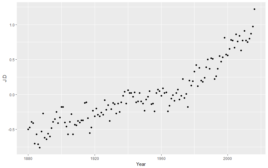
Let's try it then. We will show the average temperature anomaly for each year, telling ggplot that we will use data from dataset called nasa, specifically columns Year and J.D:
ggplot(nasa, aes(Year,J.D))
Did anything happen? No! That’s because we need to add layers to our graph. Let’s add layer with points.
ggplot(nasa, aes(Year,J.D)) + geom_point()
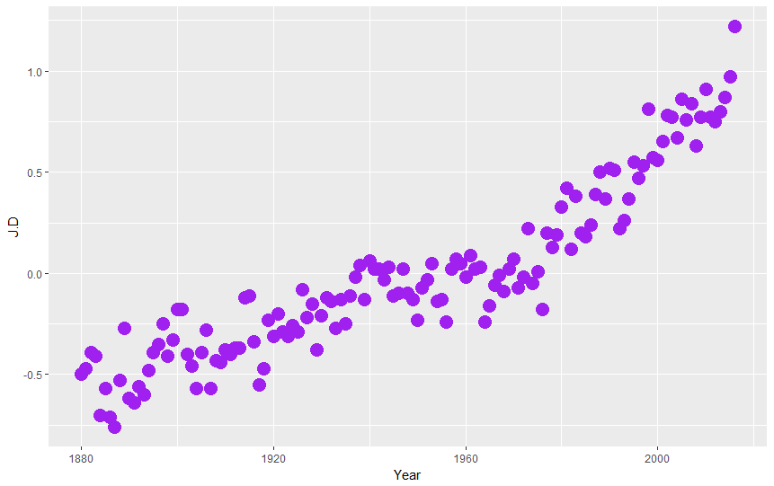
Of course we can modify the layout of our points:
ggplot(nasa, aes(Year,J.D)) + geom_point(color="purple",size=5)
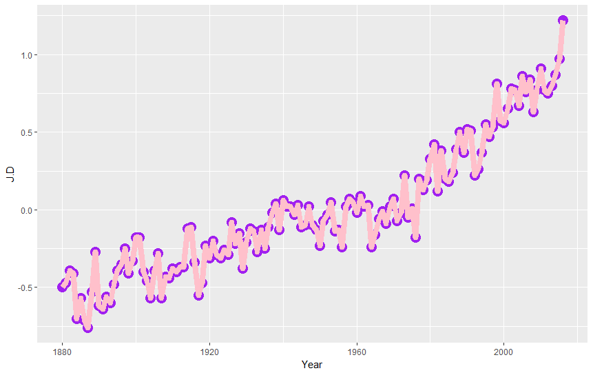
We can add additional layer, this time with line graph, playing with line color (color="pink") and width (lwd=3):
ggplot(nasa, aes(Year,J.D)) + geom_point(color="purple",size=5) + geom_line(color="pink",lwd=3)
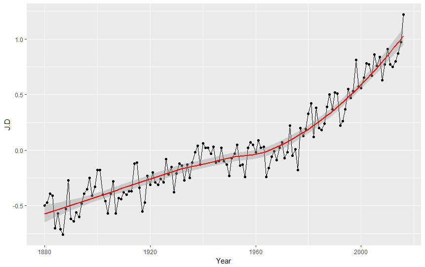
Ok but let's be serious and check what the graph tells us. We can see that the average value of temperature anomalies grows. We can emphasize it by adding trend line to our graph as the third layer! (pssst, what trend line is? It is a line on a graph showing the general direction that a group of points seem to be heading).
ggplot(nasa, aes(Year,J.D)) + geom_point() + geom_line() + geom_smooth(color="red")

Reshape Method
Great, we have proved that the annual average grows by showing each year's average on the graph. How about we try to illustrate the average anomalies monthly, for one specific year, let's say 1991, the year when Jackson's album Dangerous was released. As you know, ggplot wants us to tell him which columns go to the graph. As you see, we don't have a column containing average temperature anomaly for one specific year, instead we have rows with that information.
> head(nasa)
  Year   Jan   Feb  Mar  Apr   May   Jun  Jul  Aug  Sep  Oct  Nov   Dec  J.D
1 1880 -0.84 -0.41 -.48 -.67  -.37  -.50 -.49  .06 -.51 -.69 -.53  -.55 -.50
2 1881 -0.80 -0.63 -.37 -.28  -.05 -1.15 -.56 -.28 -.34 -.47 -.54  -.13 -.47
3 1882  0.09 -0.14 -.10 -.62  -.40 -1.05 -.74 -.14 -.10 -.35 -.42  -.70 -.39
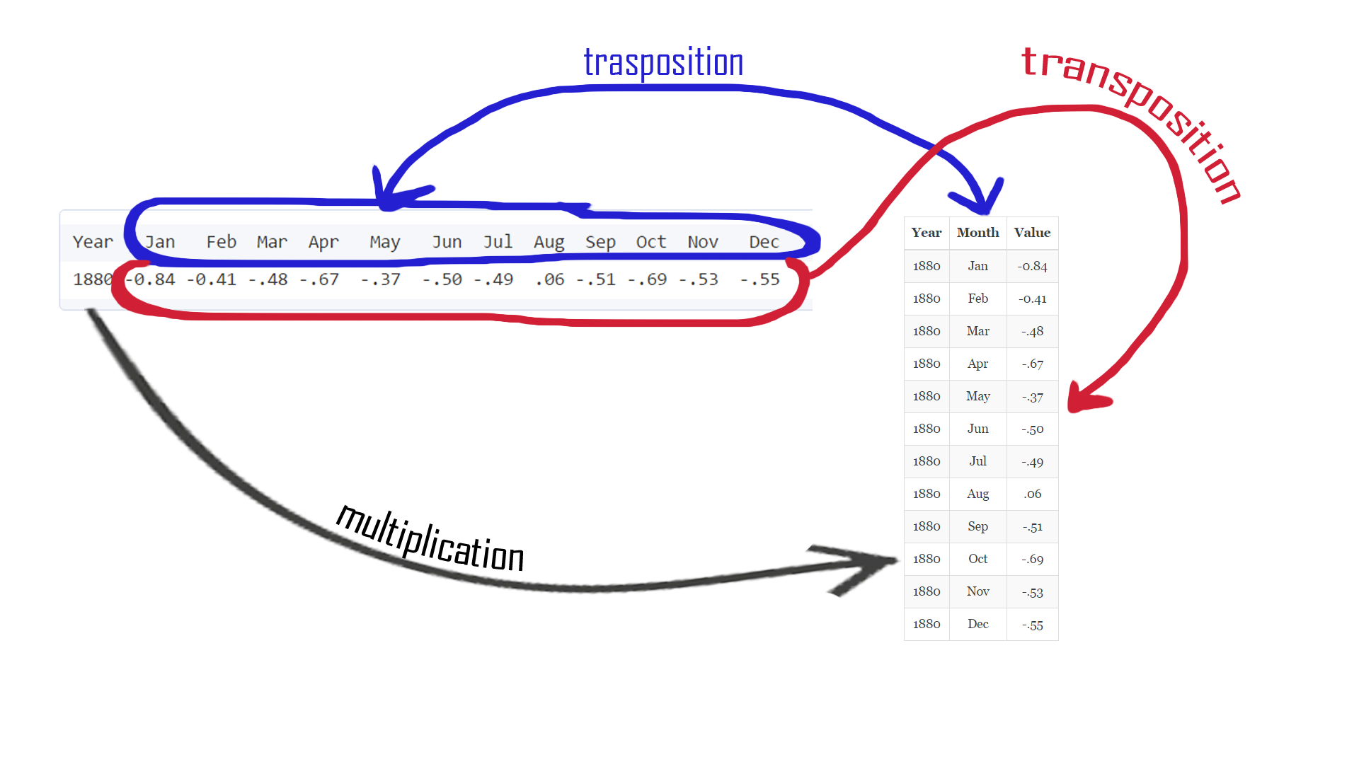
If only we could reshape our table ... But we can ;) Before we go to the super-complicated RESHAPE function, let's think about what we wanna achieve and check how the function works (psst, you can check reshape function help page, just run this command: ?reshape). There is an article created by r-bloggers about reshape and it's worth checking. Also, I've prepared a little picture that helps to understand what is going to happen:
 First, we can remove the J.D column, it is no longer useful.
nasa$J.D <- NULL
Then, we need to build function providing R informations about how our reshaped table should look like. We wanna have all measurements (deviation) in one column and dimension (month) in another. We will transform our data from horizontal (wide) into a vertical (long) format as shown on the picture above. So, let's start with telling our function the direction:
direction="long"
All deviations are our measurements. Those will be held in a new column. That column needs a name that we can use to refer to the values later on:
v.names = "Deviation"
Next step is to fill the new column with data. Currently deviations are held in columns 2 to 13, each as a separate record (row), so we tell RESHAPE function either:
varying = 2:13
or we can also refer to current columns names:
varying = list(c(“Jan”, “Feb”, “Mar”, “Apr”, “May”, “Jun”, “Jul”, “Aug”, “Sep”, “Oct”, “Nov”, “Dec”))
We have now first column with the values (measurements). We need another one with names that will identify what those measurements are (for which month the deviation was measured). Again two ways of doing it:
times = names(nasa)[2:13]
or
times = c(“Jan”, “Feb”, “Mar”, “Apr”, “May”, “Jun”, “Jul”, “Aug”, “Sep”, “Oct”, “Nov”, “Dec”)
And we need variable that we will use to refer to those values (in other words, column name):
timevar = "Month"
Our measurements are grouped based on year they were taken in. We need another column that allow us to identify that grouping.
idvar = "Year"
If the above explanation was not clear at all, don't worry, check another web pages, books, ask someone who knows better, or just copy-paste the below magic code:
nasa.reshaped <- reshape(nasa,
                          varying = list( c("Jan", "Feb", "Mar", "Apr", "May", "Jun", "Jul", "Aug", "Sep", "Oct", "Nov", "Dec")),
                          v.names = "Deviation",
                          timevar="Month",
                          times = c("Jan", "Feb", "Mar", "Apr", "May", "Jun", "Jul", "Aug", "Sep", "Oct", "Nov", "Dec"),
                          idvar = "Year",
                          direction = "long")
In result, we have received the table with columns: Year, Month, Deviation, and the following values in rows: temperature anomaly for January 1880, January 1881, January 1882 ..... and so on.
> head(nasa.reshaped)
         Year Month Deviation
1880.Jan 1880   Jan     -0.84
1881.Jan 1881   Jan     -0.80
1882.Jan 1882   Jan      0.09
1883.Jan 1883   Jan     -0.71
1884.Jan 1884   Jan     -0.64
1885.Jan 1885   Jan     -0.97
To select particular year from the dataset we can use:
> nasa.reshaped.1991 <- nasa.reshaped[nasa.reshaped$Year==1991,]
> nasa.reshaped.1991
         Year Month Deviation
1991.Jan 1991   Jan      0.49
1991.Feb 1991   Feb      0.61
1991.Mar 1991   Mar      0.47
1991.Apr 1991   Apr      0.72
1991.May 1991   May      0.41
1991.Jun 1991   Jun      0.68
1991.Jul 1991   Jul      0.62
1991.Aug 1991   Aug      0.55
1991.Sep 1991   Sep      0.62
1991.Oct 1991   Oct      0.34
1991.Nov 1991   Nov      0.32
1991.Dec 1991   Dec      0.32
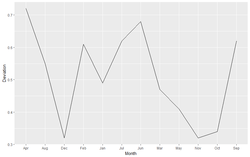
So now we can ask ggplot to draw a line graph using subset nasa.reshaped.1991, columns Month and Deviation.
ggplot(nasa.reshaped.1991, aes(x=Month,y=Deviation)) + geom_line()
Did you receive the error message geom_path: Each group consists of only one observation. Do you need to adjust the group aesthetic? Good! Why is this happening? As Cookbook for R (Chapter: Graphs Bar_and_line_graphs_(ggplot2), Line graphs) says
For line graphs, the data points must be grouped so that it knows which points to connect. In this case, it is simple – all points should be connected, so group=1. When more variables are used and multiple lines are drawn, the grouping for lines is usually done by variable.
Therefore, we add group = 1 to our aestethics et voilà:
ggplot(nasa.reshaped.1991, aes(x=Month,y=Deviation,group=1)) + geom_line()
Factors and Levels
The picture is looking sligthly better, but there is one thing ruining it. Can you see it yet? How about quick look on the X axis?

That's right, R had arranged our values alphabetically. Why? Because it's only a computer and doesn't know that months have special order for us, humans. For R months are only useless strings of letters. Let's make it right using FACTOR. What is factor? To read some stale theory go to this page. But to put it simply, factor is a type of a variable that can store other variables and give them some VALUE or ORDER (levels). Let's say I have a vector containing ice cream flavours (flavours <- c("onion","chocolate","vanilla")). With factor, I can define order of flavours making sure that vanilla is the best, and onion is totally gross:
> flavours <- factor(flavours,levels=c("vanilla","chocolate","onion"))
> flavours
[1] onion chocolate vanilla
Levels: vanilla chocolate onion
We need to do the same thing with months names. So for the whole nasa.reshaped table let’s execute:
nasa.reshaped$Month <- factor(nasa.reshaped$Month, levels = c("Jan", "Feb", "Mar",
                                                                  "Apr", "May", "Jun",
                                                                  "Jul", "Aug", "Sep",
                                                                  "Oct", "Nov", "Dec"))
Now you can reload data to nasa.reshaped.1991, recreate the graph and check if everything is ok.
Graph like this can be drawn for every year in our table. How about we try to illustrate monthly temperatures for each year on one picture? (spoiler alert: it will reveal the real growth on temperatures anomalies). For whole nasa.reshaped table let's execute:
ggplot( data=nasa.reshaped, aes( x=Month, y=Deviation ) ) + geom_line()
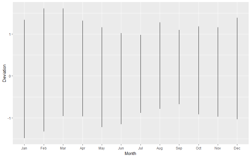
This is not pretty, is it? Again, remembering that "for line graphs, the data points must be grouped so that it knows which points to connect.", we must tell R we want to group points by year (group=Year), so we end up with one line for 1880, one line for 1881, one line for 1882, (...), etc. Also, to improve readability, we will add some colour, telling R it should colour lines by year (colour=Year).
ggplot( data=nasa.reshaped, aes( x=Month, y=Deviation, group=Year, colour=Year ) ) + geom_line()
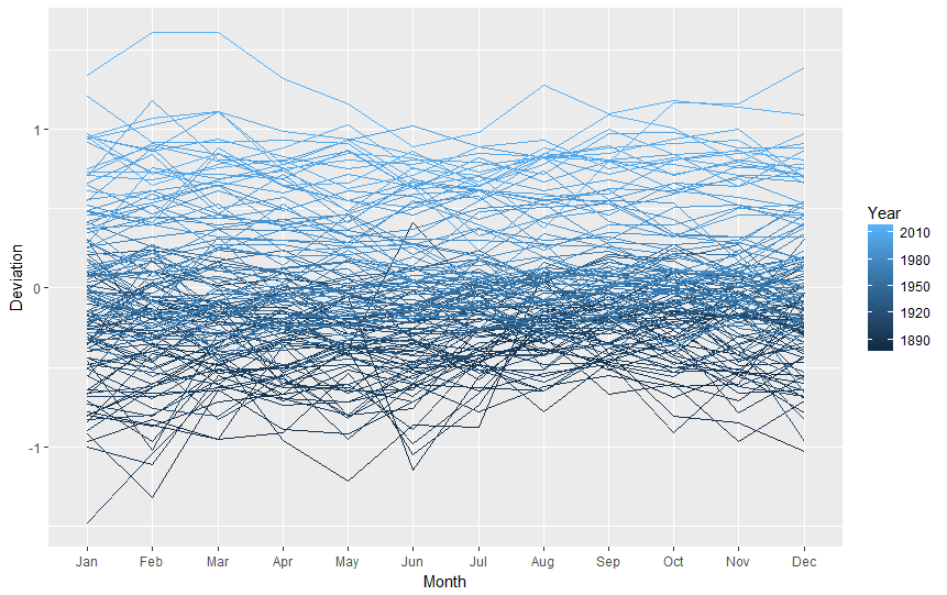
The graph we received is nice, clean and informative (I hope so). That would be all for now! :)
ymra
*Temperature anomalies indicate how much warmer or colder it is than normal for a particular place and time. For the GISS analysis, normal always means the average over the 30-year period 1951-1980 for that place and time of year. This base period is specific to GISS, not universal. But note that trends do not depend on the choice of the base period: If the absolute temperature at a specific location is 2 degrees higher than a year ago, so is the corresponding temperature anomaly, no matter what base period is selected, since the normal temperature used as base point is the same for both years. Note that regional mean anomalies (in particular global anomalies) are not computed from the current absolute mean and the 1951-80 mean for that region, but from station temperature anomalies. Finding absolute regional means encounters significant difficulties that create large uncertainties. This is why the GISS analysis deals with anomalies rather than absolute temperatures. For a more detailed discussion of that topic, please see "The Elusive Absolute Temperature". (SOURCE)