
Graphs generated dynamically on hover (using R, shiny and plotly)
Hello! Recently I was asked to create an R program showing one graph and dynamically generating another using the information about mouse position over the first graph. It is not as difficult as I thought, so here's the tutorial.
What we wanna achieve?
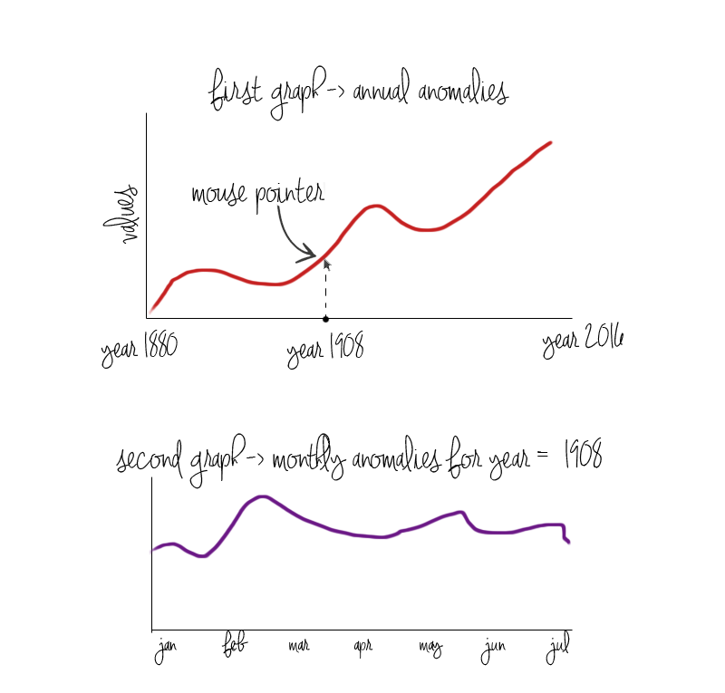
We're gonna create a simple R application showing annual and monthly average temperature anomalies. On one static graph we will illustrate the annual average temperature anomalies, showing that they are constantly growing. While moving the mouse over this graph, we will dynamically generate another graph, which will illustrate monthly average temperature anomalies for the specific year our mouse is pointing to. Let me show this idea on a picture.
What we need?
- shiny library, which is “A web application framework for R” and “turns your analyses into interactive web applications”
- plotly library, to draw plots
- 2 R files, one called server.R (script that contains the instructions that your computer needs to build your app) and one called ui.R (script that controls the layout and appearance of your app)
- data
You can download data files from here and here. These are excel sheets prepared from the data availaible on NASA page (link). Nasa's data looks like that:
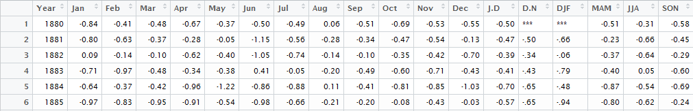
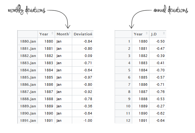
It contains the year, average temperature anomaly for each month (January to December), than the average values for periods January-December, December-November and each quarter. What we've created from it:
To install shiny and plotly execute:
install.packages("shiny")
install.packages("plotly")
library("plotly")
library("shiny")
Building app.
Now, our program has 2 components and their schema is imposed by Shiny. You can learn more about Shiny by visiting their website www.shiny.rstudio.com
We will start with ui.R, which by default looks like that:
library(shiny)
ui <- fluidPage(

)
We will add few lines:
library(shiny)
library(plotly)
ui <- fluidPage(
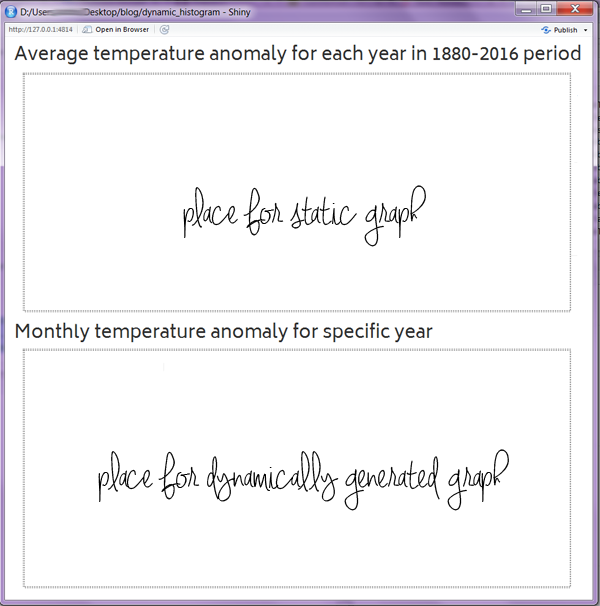
h2("Average temperature anomaly for each year in 1880-2016 period"),
plotlyOutput("plot"),
h2("Monthly temperature anomaly for specific year"),
plotlyOutput("plot2")
)
where:
library(plotly)is the information that we gonna use plotly libraryh2("Average temperature anomaly for each year in 1880-2016 period")is the header of first sectionplotlyOutput("plot")is the place for output of the plotly function (the graph) we will call ploth2("Monthly temperature anomaly for specific year")is the header of second sectionplotlyOutput("plot2")is the place for output of the plotly function (the graph) we will call plot2
This is what we've created so far:
If we are minimalists and don't need our program to be fancy-looking, this is all we have to do. Now, to the server.R part! By default, it looks like that:
library(shiny)
server <- function(input, output) {

}
We wanna tell our script few things. First, we will use plotly, so we should add library(plotly) just below library(shiny).Then, we have to import the data we will work on. Also, script has to know that we have created 2 areas to plot graphs, called plot and plot2 and the output of our actions should be directed to them. Hence:
library(shiny)
library(plotly)

server <- function(input, output) {

monthly <- read.csv(file="path_to_monthly_file.csv",sep=",",header=TRUE)
annual <- read.csv(file="path_to_annual_file.csv",sep=",",header=TRUE)

  output$plot <- renderPlotly({

    })

  output$plot2 <- renderPlotly({

    })
}
We will wrap all the actions generating graphs in a call to renderPlot to indicate that:
- It is “reactive” and therefore should re-execute automatically when inputs change
- Its output type is a plot
Plotting graphs.
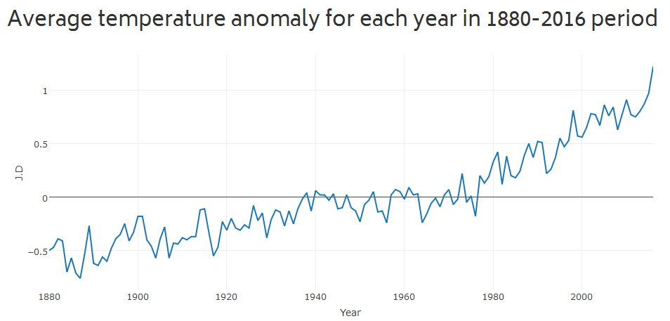
Now we can go straight to the point, which means plotting graphs! Building the first, static graph will be very easy (level: one-line-easiness). We only have to tell plotly "dude, take my annual dataset, put Years on Y axis, put temperature anomalies on Y axis, make it a scatter chart, where data are presented as line", translate it to plotly language and place in the first plot output:
output$plot <- renderPlotly({
    plot_ly(annual, x=~Year, y=~J.D, type = "scatter", mode="lines")
})
By the way, plotly is an awesome tool, so awesome you should go right now to its page and learn more about it. If you are too lazy to do that, just type ?plotly into R console. Also, here you can find something about chart types in Plotly.
And now the most interesting part, generating graph dynamically on hover. To know where our mouse pointer is, we have to capture and store mouse event (check documentation).
mouse_event <- event_data("plotly_hover")
If you are curious how mouse event looks like, here is the one captured while mouse pointer is over year 2016 point of graph:
print(mouse_event)
        curveNumber pointNumber    x    y
1           0         136         2016 1.22
What we need is the year, stored in the third column of event (curveNumber = first column, pointNumber = second column, x = third column). We wanna store that information in a variable called...wait for it....year. Yep.
year <- mouse_event[3]
Now we wanna plot the graph showing monthly temperature anomalies for this particular year, so let's create a subset from our monthly dataset selecting only these rows where year = particular year captured in mouse event.
monthly_subset <- monthly[monthly$Year==year$x,]
And plot a graph:
plot_ly(monthly_subset, x=~Month, y=~Deviation, type = "scatter", mode = "points + lines")
So to sum this part up, this is what your output$plot2 should look like:
  output$plot2 <- renderPlotly({
    mouse_event <- event_data("plotly_hover")
    year <- mouse_event[3]
    monthly_subset <- monthly[monthly$Year==year$x,]
    plot_ly(monthly_subset, x=~Month, y=~Deviation,type = "scatter", mode = "points + lines")
  })
Or, if you want your code to take only 1 line instead of 4 and be impossible to understand, you can do that:
  output$plot2 <- renderPlotly({
    plot_ly(monthly[monthly$Year==event_data("plotly_hover")[3]$x,], x=~Month, y=~Deviation, type = "scatter", mode="lines + points")
  })
Are you ready to see the final result? Put your mouse pointer over the graph!
You can reviev the files below, or on my github.
          library(shiny)
          library(plotly)

          ui <- fluidPage(
            h4("Average temperature anomaly for each year in 1880-2016 period",align="center"),
            div(plotlyOutput("plot",width = "500px", height = "300px"), align = "center"),
            h4("Monthly temperature anomaly for specific year",align="center"),
            div(plotlyOutput("plot2",width = "500px", height = "300px"), align = "center")
          )
            library(shiny)
            library(plotly)


            server <- function(input, output) {
              # Read data
              monthly <- read.csv(file="monthly.csv", sep=",", header = TRUE)
              annual <- read.csv(file="annual.csv", sep=",", header = TRUE)

              monthly$Month <- factor(monthly$Month, levels = c("Jan", "Feb", "Mar",
                                      "Apr", "May", "Jun",
                                      "Jul", "Aug", "Sep",
                                      "Oct", "Nov", "Dec"))

              output$plot <- renderPlotly({
              plot_ly(annual, x=~Year, y=~J.D,type = "scatter", mode="lines")
              })

              output$plot2 <- renderPlotly({
              mouse_event <- event_data("plotly_hover")
              year <- mouse_event[3]
              monthly_subset <- monthly[monthly$Year==year$x,]
              plot_ly(monthly_subset, x=~Month, y=~Deviation, type = "scatter", mode="lines + points")
              })
            }
ymra