
Beautifying plotly graphs in R.
Hello! Till now I was styling the graphs in Photoshop rather than prepare them properly in RStudio (sooo lame, huh?) But I decided it's time to learn how to do it, so here is the little tutorial about making a plot beautiful using only R and plotly package. We'll gonna play with San Francisco average monthly temperatures availaible here.
What we have to do before plotting a graph:
a <- c(1:12)
b <- c(23, 28,  38, 54,  73, 42,  24, 27,  78, 63,  41, 51)
weather <- data.frame(month=a,temp=b)
weather
   month temp
1      1   10
2      2   11
3      3   11
4      4   11
5      5   13
6      6   13
7      7   14
8      8   14
9      9   14
10    10   14
11    11   13
12    12   10
Quick reminder about plotly:
plotly charts are described declaratively in the call signature of plotly::plot_ly, plotly::add_trace, and plotly::layout. Every aspect of a plotly chart (the colors, the grid-lines, the data, and so on) has a corresponding key in these call signatures. This page contains an extensive list of these attributes.
Plotly's graph description places attributes into two categories: traces (which describe a single series of data in a graph) and layout attributes that apply to the rest of the chart, like the title, xaxis, or annotations).
Here is a simple example of a plotly chart inlined with links to each attribute's reference section.
library(plotly)

p <- plot_ly(economics,
             type = "scatter",        # all "scatter" attributes: https://plot.ly/r/reference/#scatter
             x = ~date,               # more about scatter's "x": /r/reference/#scatter-x
             y = ~uempmed,            # more about scatter's "y": /r/reference/#scatter-y
             name = "unemployment",   # more about scatter's "name": /r/reference/#scatter-name
             marker = list(           # marker is a named list, valid keys: /r/reference/#scatter-marker
               color="#264E86"        # more about marker's "color" attribute: /r/reference/#scatter-marker-color
             )) %>%
  layout(                        # all of layout's properties: /r/reference/#layout
         title = "Unemployment", # layout's title: /r/reference/#layout-title
         xaxis = list(           # layout's xaxis is a named list. List of valid keys: /r/reference/#layout-xaxis
            title = "Time",      # xaxis's title: /r/reference/#layout-xaxis-title
            showgrid = F),       # xaxis's showgrid: /r/reference/#layout-xaxis-showgrid
         yaxis = list(           # layout's yaxis is a named list. List of valid keys: /r/reference/#layout-yaxis
            title = "uidx")     # yaxis's title: /r/reference/#layout-yaxis-title
  )
Having that in mind let’s create the simplest possible barplot with empty layout attribute:
p <- plot_ly(
    x = weather$month,
    y = weather$temp,
    type = "bar"
) %>%
layout()
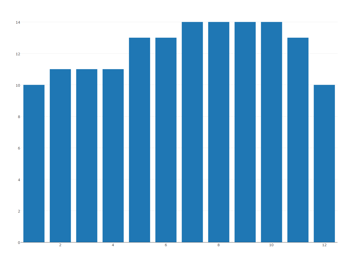
Now we can start styling it! Here you can check all possible layout properties.
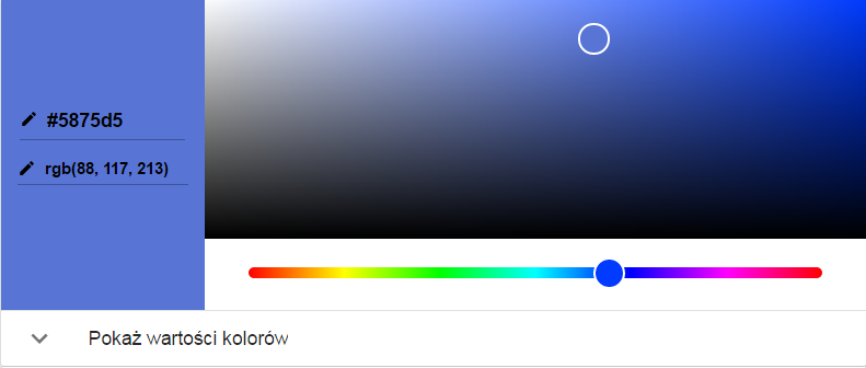
Changing background color
I’m gonna kick off with changing the background. To do so, we have to add 2 keys to layout: paper_bgcolor (sets the color of paper where the graph is drawn.) and plot_bgcolor (sets the color of plotting area in-between x and y axes.) I chose a nice, royal blue.
layout(paper_bgcolor='#5875D5',
       plot_bgcolor='#5875D5')
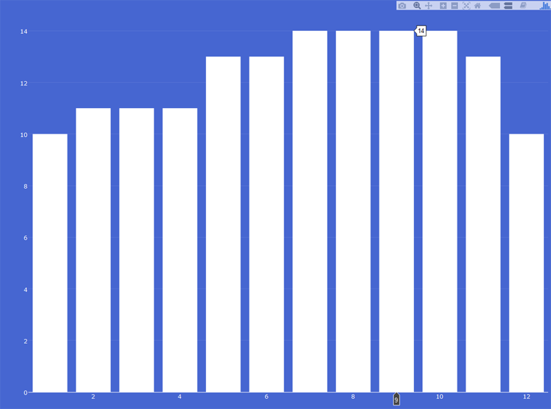
Changing bars color
If you did too, you can now see that the plot became completely unreadable. Let’s fix it by changing bar’s color to white, adding marker = list(color = '#ffffff') (sets the marker color; it accepts either a specific color or an array of numbers that are mapped to the colorscale relative to the max and min values of the array or relative to `cmin` and `cmax` if set) to plot_ly part:
plot_ly(
    x = weather$month,
    y = weather$temp,
    type = "bar"
    marker = list(color = '#ffffff')
   ) %>%
   layout()
Styling axis
Now we can proceed to styling X and Y axis. We will continue adding the keys to the layout part, right after plot_bgcolor. As both xaxis and yaxis will have many arguments, we will wrap them in list(). See below:
layout(paper_bgcolor='#4666d1',
        plot_bgcolor='#4666d1',
       xaxis = list(place for arguments),
       yaxis = list(place for arguments)
)
First thing, let’s adjust the color and make it white:
xaxis = list(
        color = '#ffffff'),
yaxis = list(
        color = '#ffffff')
So far, we have this:
How about adding some text, so we would know what are we looking at? Let’s replace X axis values by month’s names.
weather$month <- c("Jan", "Feb", "Mar", "Apr", "May", "Jun", "Jul", "Aug", "Sep", "Oct", "Nov", "Dec")
Let’s make them a factor and add levels, so R knows that they have specific order. (You can read more about it in previous post, section Factors and Levels)
factor(weather$month, levels = c("Jan", "Feb", "Mar",
                                        "Apr", "May", "Jun",
                                        "Jul", "Aug", "Sep",
                                        "Oct", "Nov", "Dec"))
If you re-generate the plot, the month’s names should be visible under the bars.

Rotating axis text
I don’t like it that way, I prefer them rotated a bit. To rotate, add to xaxis a tickangle key.
xaxis = list(
        color = '#ffffff',
        tickangle = -45
),

Much better. We don’t need to add title to the x axis, I think we can easily guess what it represents, but y axis could use one, therefore we add title key to the yaxis part:
yaxis = list(
        color = '#ffffff',
        title = "degrees in Celsius")
But surely you would say “hey, but I want to show Celsius degrees by printing this cute little circle, like everyone else!” No worries. Change "degrees in Celsius" to "degrees in \U2103" and you have it. (why U2130 changes to the cute circle? Here is the answer.)
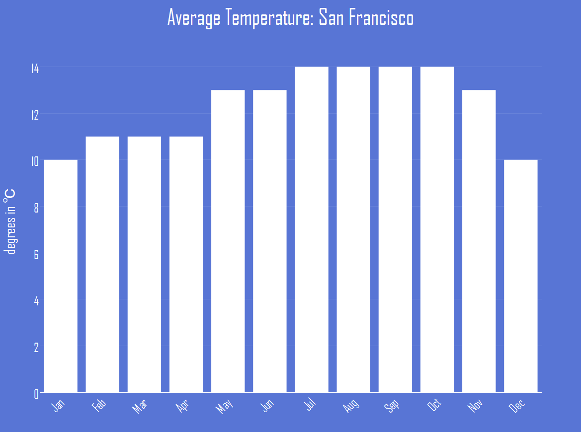
Styling titles
We nearly have it, we are only missing the general title and some font styling. Let’s add a title to the general layout part:
title = "Average Temperature: San Francisco"
and choose font properties. Again, we will wrap arguments in list(). Read more about title font here.
titlefont = list(
                family = "Agency FB",
                size = 30,
                color = '#ffffff')
I chose the Agency FB font, you can use anything that is present in your operating system. Now what is left is to define the same font for both x and y axis:
font = list(
                family = "Agency FB",
                size = 25)
As you can see, my plot is too big and doesn’t fit to the window. Let’s add a 10px margin:
         title = "Average Temperature: San Francisco",
         titlefont = list(
           family = "Agency FB",
           size = 45,
           color = '#ffffff'),
         font = list(
           family = "Agency FB",
           size = 25),
         margin = 10,
et voila:
You will find the complete code at the end of this article.
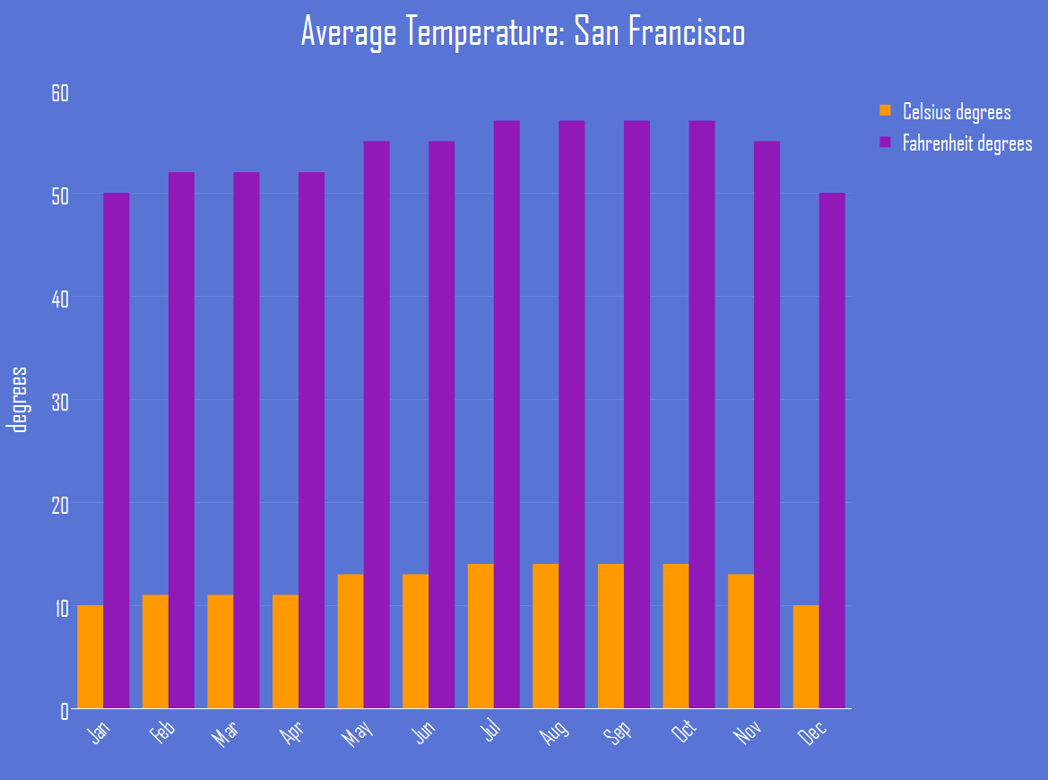
Bars in different colors
The above plot is simple and not crazy at all. Let's add more colors showing both Celsius and Fahrenheit degrees on one plot. First step, we need to change the white color of bars to something more fancy. I propose #ff9900, or as Html Css Color calls it, Orage Peel. Change:
plot_ly(
  x = weather$month,
  y = weather$temp,
  type = "bar",
  marker = list(color = '#ff9900'),
) %>%
Then we need to add Fahrenheit data:
weather$fahrenheit <- c(50, 52, 52, 52, 55, 55, 57, 57, 57, 57, 55, 50)
and plot it:
plotly(...)
 %>%
 add_trace(y = ~weather$fahrenheit) %>%
 layout(...)
R is quite intelligent and seeing that we are plotting two types of bars it have added a legend on the side. Here is what we gonna do to add a final cut to the plot:
-
add names to the traces, so the legend says “Celsius degrees, Farenheit degrees”, not trace 0 and trace 1
-
change Y axis title, as its no longer Celsius degrees
-
add color to Fahrenheit bars (what do you think about
#9119b8, called Dark Orchid?)
plot_ly(
...
...
  name = "Celsius degrees"
) %>%
  add_trace(y = ~weather$fahrenheit,
            marker = list(color = '#9119b8' ),
            name = "Fahrenheit degrees"
            ) %>%
Here’s the result:

Full code:
a <- c(1:12)
b <- c(10,  11,  11,  11,  13,  13,  14,  14,  14,  14,  13,  10)
weather <- data.frame(month=a,temp=b)
weather$month <- c('Jan', 'Feb','Mar','Apr','May','Jun','Jul','Aug','Sep','Oct','Nov','Dec')
weather$month <- factor(weather$month, levels = c("Jan", "Feb", "Mar",
                                        "Apr", "May", "Jun",
                                        "Jul", "Aug", "Sep",
                                        "Oct", "Nov", "Dec"))

plot_ly(
  x = weather$month,
  y = weather$temp,
  type = "bar",
  marker = list(color = '#ffffff'),
   ) %>%
       layout(paper_bgcolor='#5875D5',plot_bgcolor='#5875D5',
              xaxis = list(
                      color = '#ffffff',
                      tickangle = -45),
              yaxis = list(
                      color = '#ffffff',
                      title = "degrees in \U2103"),
              title = "Average Temperature: San Francisco",
              titlefont = list(
                family = "Agency FB",
                size = 45,
                color = '#ffffff'),
              font = list(
                family = "Agency FB",
                size = 25),
              margin = 10
        )
a <- c(1:12)
b <- c(10,  11,  11,  11,  13,  13,  14,  14,  14,  14,  13,  10)
c <- c(50,  52,  52,  52,  55,  55,  57,  57,  57,  57,  55,  50)
weather <- data.frame(month=a,temp=b, fahrenheit=c)
weather$month <- c('Jan', 'Feb','Mar','Apr','May','Jun','Jul','Aug','Sep','Oct','Nov','Dec')
weather$month <- factor(weather$month, levels = c("Jan", "Feb", "Mar",
                                                  "Apr", "May", "Jun",
                                                  "Jul", "Aug", "Sep",
                                                  "Oct", "Nov", "Dec"))

plot_ly(
  x = weather$month,
  y = weather$temp,
  type = "bar",
  marker = list(color = '#ff9900'),
  name = "Celsius degrees"
) %>%
  add_trace(y = ~weather$fahrenheit,
            marker = list(color = '#9119b8' ),
            name = "Fahrenheit degrees"
            ) %>%
  layout(paper_bgcolor='#5875D5',plot_bgcolor='#5875D5',
         xaxis = list(
           color = '#ffffff',
           tickangle = -45),
         yaxis = list(
           color = '#ffffff',
           title = "degrees"),
         title = "Average Temperature: San Francisco",
         titlefont = list(
           family = "Agency FB",
           size = 45,
           color = '#ffffff'),
         font = list(
           family = "Agency FB",
           size = 25),
         margin = 10,
         legend = list(font=list(color = '#ffffff'))
  )
ymra